Back in 1979, Hayden Fry, the head football coach at the University of Iowa, attempted to use color psychology as a strategic advantage for his Hawkeyes. He had the visiting team’s locker room painted entirely in pink. Why? Well, with a degree in psychology, Hayden knew that pink could have a calming and pacifying effect of people—basically, he wanted his opponents feeling like they’d just walked out of a relaxing spa instead of gearing up for battle. Whether it genuinely worked or not is still up for debate—more on that in a moment—but you have to admit, it’s a memorable (and hilarious) attempt at using color to get inside the minds of an opponent.
This quirky story isn’t just a footnote in sports history though; it’s a fun reminder that color holds a lot of power over how we think, feel, and behave. When it comes to branding, using color the right way can evoke strong emotions, inspire action, and make your brand unforgettable. So, let’s dive into seven practical ways you can harness the power of color to elevate your brand and connect with your audience.
By the way, in the 20 years prior to painting the visitor’s locker room pink the University of Iowa Hawkeyes football team had a distressing overall record of 68 wins, 127 losses, and 4 ties. And the 20 years after? 143 wins, 89 losses, and 6 ties.
Understanding Color Psychology
What is Color Psychology?
Color psychology is the study of how colors impact human behavior and emotions. It’s a powerful tool in branding because it directly influences how people perceive and interact with your brand. When used correctly, color can evoke emotions, inspire actions, and make your brand instantly recognizable.
The Basic Color Wheel and Its Meaning
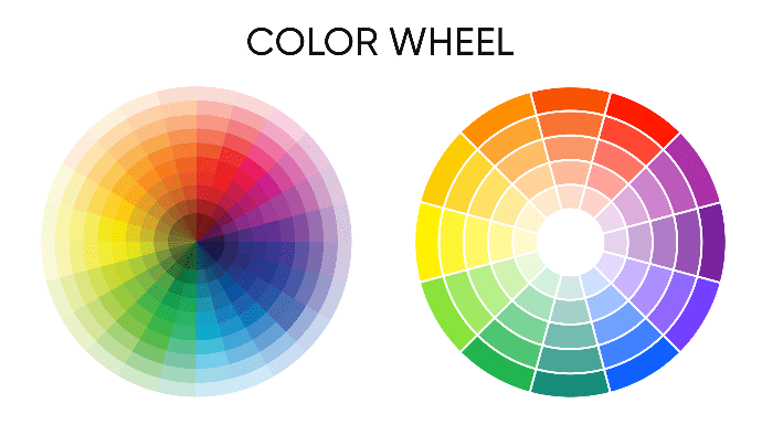
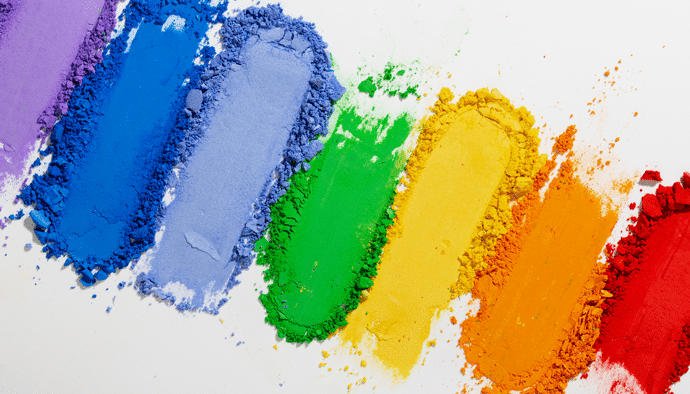
The color wheel is an essential tool in design, grouping colors into primary (red, yellow, blue), secondary (green, orange, purple), and tertiary colors (mixes of primary and secondary), essentially every other color you can imagine. Knowing the basics can help you pair colors complementary hues for maximum impact. You can use this intuitive color wheel to get started and explore more about color.
The Psychology of Specific Colors
Color isn’t just about aesthetics—it’s a powerful device that influences human emotions, behaviors, and perceptions. From the calming hues of blue to the stimulating energy of red, colors play a vital role in how we react to our surroundings and even make decisions. Businesses and brands have long leveraged the psychological impact of colors to shape their image and connect with consumers on a deeper level. But what makes certain colors resonate more than others? How do personal, cultural, and contextual factors shape our preferences? Let’s go further down the rabbit hole and find out …
In 2003, the University of Maryland conducted the largest study to date on favorite colors, exploring these questions in depth. This comprehensive study surveyed over 2,000 men and women from ten countries, including the United States, Canada, Mexico, the United Kingdom, Germany, Spain, France, Russia, China, and Japan. Participants rated their preference for 24 different colors on a scale from 1 (least favorite) to 7 (most favorite). The results revealed that blue was the most popular color overall, followed by green, black, and red. Notably, the study found gender differences—women were more likely to prefer blue and purple, while men leaned toward black and green. It also highlighted cultural variations, with certain countries showing stronger preferences for specific colors than others.
The University of Maryland study remains one of the most significant in the field of color psychology due to its large, diverse sample size and international scope. However, it also reminds us that color preferences are complex and can vary based on many factors, including individual experiences, cultural context, and situational influences. Understanding these nuances is key to using color effectively in branding and design, making the study a valuable resource for marketers, designers, and psychologists alike.
Here’s a detailed breakdown of each color, with insights drawn from the latest research and studies in color psychology, including the 2003 University of Maryland study.
Red
Psychological Impact: According to the University of Maryland study, red is a highly stimulating color that evokes strong emotional reactions such as excitement, passion, and even aggression. It has a physical impact on viewers, increasing heart rate and triggering a sense of urgency or alertness. This makes red a popular choice for brands seeking to grab attention and evoke strong feelings quickly. It’s why sales signs, urgent calls to action, and fast-food chains often use red to stimulate appetite and encourage rapid decisions.
Behavioral Influence: The study demonstrated that red’s stimulating effects can lead to increased energy and heightened awareness. This can be advantageous for creating a sense of urgency but must be used carefully, as overexposure can cause anxiety or aggression.
Usage in Branding: Red’s ability to evoke excitement and stimulate impulse behavior explains its use by brands like Coca-Cola, Target, and YouTube. It is particularly effective for industries focused on food, sales, entertainment, and high-energy environments.
Cultural Context: The study also noted that cultural interpretations of red vary. In Western cultures, red is often associated with passion or danger, while in some Eastern cultures, it symbolizes luck and prosperity.
Orange
Psychological Impact: Orange was highlighted in the study as an energetic and friendly color, exuding warmth and enthusiasm. It evokes feelings of excitement but is less intense than red, making it a great balance between urgency and approachability. Orange is frequently used to promote creativity and social interaction, as it creates a sense of fun and positivity.
Behavioral Influence: The study found that orange tends to increase feelings of excitement and warmth, encouraging more sociable behavior. It often boosts mood and engagement, making it effective for creating a welcoming brand presence.
Usage in Branding: Orange is ideal for brands wanting to appear youthful, fun, and inviting. It’s commonly seen in industries like entertainment (Nickelodeon), retail (Home Depot), and food and beverage (Fanta). Its ability to create urgency without the aggressiveness of red also makes it popular for promotions and clearance sales.
Cultural Context: While orange is viewed as energetic and warm in many Western cultures, its significance can vary elsewhere—such as in Hinduism, where it holds spiritual significance.
Yellow
Psychological Impact: Yellow is strongly associated with happiness, optimism, and warmth, according to the study. It grabs attention and evokes feelings of cheerfulness and energy. However, the research also indicated that excessive yellow can lead to eye strain and cause feelings of anxiety, suggesting that its usage should be balanced carefully.
Behavioral Influence: Yellow’s bright and energetic nature encourages creativity and mental stimulation. It can boost memory and attention, making it a strong color for signage and advertising meant to catch the eye quickly.
Usage in Branding: Yellow is often used to evoke feelings of positivity and cheer. Brands like McDonald’s, Ikea, and Snapchat use yellow to create a friendly, approachable image. The color is particularly effective for drawing attention, so it is often used in call-to-action buttons and promotional materials.
Cultural Context: The cultural significance of yellow varies widely. In Western contexts, it is often linked to happiness, but in some Eastern cultures, it can be associated with sacredness or even mourning.
Green
Psychological Impact: Green represents balance, health, and renewal, as highlighted by the study. It is strongly linked to nature, making it inherently calming and soothing. Green’s calming effect on the human mind and body is one reason why it is used to reduce stress and create a sense of peace.
Behavioral Influence: The study found that green promotes a sense of balance and tranquility, encouraging feelings of calmness and comfort. Darker greens are often linked with affluence and stability, while lighter greens are more refreshing and symbolize growth.
Usage in Branding: Green is widely used by eco-friendly and health-conscious brands, such as Whole Foods, Starbucks, and John Deere. Its natural connotation makes it a top choice for companies promoting wellness, sustainability, or growth.
Cultural Context: In Western cultures, green often symbolizes nature, luck, and renewal. In Islamic cultures, it holds spiritual importance, and in some Asian cultures, it can represent youth or fertility.
Blue
Psychological Impact: Blue is one of the most calming and universally liked colors, according to the study. It evokes feelings of trust, security, and dependability, making it an excellent choice for industries like finance, healthcare, and technology. Blue also has a calming effect on the mind, reducing anxiety and promoting a sense of tranquility.
Behavioral Influence: Blue’s ability to lower heart rate and reduce stress levels makes it effective for creating a sense of calm and trust. The study indicated that it can promote productivity and clear communication, making it a favorite in corporate branding.
Usage in Branding: Blue is often used by companies looking to build trust and loyalty, such as Facebook, Twitter, and IBM. Lighter blues are friendly and refreshing, while darker blues convey authority and professionalism.
Cultural Context: Blue’s meaning can vary by culture but is often associated with stability, loyalty, and calmness. In some cultures, it is linked to mourning, but it is typically a positive, dependable color worldwide.
Purple/Violet
Psychological Impact: Purple has long been associated with royalty, luxury, and creativity, as noted in the study. The combination of blue’s calm and red’s intensity gives it a unique position to evoke mystery, ambition, and sophistication.
Behavioral Influence: Purple can inspire creativity and imagination, making it popular with brands wanting to stand out as innovative or unique. The study noted that darker shades of purple suggest luxury and exclusivity, while lighter shades create a more whimsical, light-hearted feel.
Usage in Branding: Purple is commonly used by high-end and creative brands such as Cadbury, Hallmark, and Twitch. It evokes a sense of grandeur, mystery, and innovation, making it ideal for industries ranging from luxury goods to creative arts.
Cultural Context: Purple often symbolizes royalty, spirituality, and wisdom in many cultures. In some Asian cultures, it can represent wealth and prosperity.
Brown
Psychological Impact: Brown is an earthy, grounded color that evokes feelings of stability, warmth, and reliability. The study found that brown’s natural association with the earth makes it comforting and reassuring, but it can also come across as dull if not used thoughtfully.
Behavioral Influence: Brown promotes feelings of dependability and security. It is often used to create a sense of warmth and stability, making it a great fit for brands that emphasize tradition or craftsmanship.
Usage in Branding: Brown is frequently used by brands that want to convey warmth, authenticity, and dependability, such as UPS, Hershey’s, and Nespresso.
Cultural Context: In many cultures, brown is associated with nature and simplicity, but it can also have different meanings, such as humility or groundedness.
Pink
Psychological Impact: The study highlighted pink’s versatility—ranging from soft, nurturing shades that evoke calmness and romance to bold, vibrant tones that exude energy and playfulness. Pink’s association with femininity is well-known, but it can also be used to break stereotypes and stand out.
Behavioral Influence: Light pinks evoke a sense of warmth, compassion, and gentleness. Vibrant pinks grab attention and convey confidence, making them great for brands looking to appear energetic or edgy.
Usage in Branding: Pink is used by brands like Barbie, Victoria’s Secret, and T-Mobile to create a sense of warmth, femininity, or boldness. Its adaptability makes it effective for various industries.
Cultural Context: Pink’s association with femininity is prominent in many Western cultures but is increasingly used as a gender-neutral color in various contexts.
Black
Psychological Impact: Black symbolizes power, elegance, sophistication, and mystery. The study found that black’s strong visual impact makes it effective for brands wanting to appear high-end, modern, or authoritative.
Behavioral Influence: Black creates a sense of authority, luxury, and exclusivity. It can also evoke feelings of sophistication and mystery, making it a favorite in the fashion and tech industries.
Usage in Branding: Luxury brands like Chanel, Nike, and Apple use black to evoke sleekness, power, and modernity. Black provides contrast and makes other colors pop, but too much can feel oppressive or negative.
Cultural Context: Black has different meanings across cultures—often symbolizing elegance and power but also associated with mourning and death in certain contexts.
Gray
Psychological Impact: Gray is a neutral, balanced color that conveys professionalism, maturity, and subtle elegance. The study found that gray can create a sense of calm and stability but may also feel detached if used excessively.
Behavioral Influence: Gray’s neutrality makes it effective for conveying professionalism and balance. It serves as a background color that allows other elements to stand out.
Usage in Branding: Tech and automotive brands like Apple, Mercedes-Benz, and Honda use gray for a refined, sophisticated look. Pairing it with more vibrant colors prevents it from appearing too bland.
Cultural Context: In some cultures, gray may symbolize formality or conservatism, but it often represents neutrality and balance.
White
Psychological Impact: White symbolizes purity, simplicity, and cleanliness. The study noted that white can create a sense of openness and space, making it ideal for minimalist and modern designs.
Behavioral Influence: White promotes clarity, fresh starts, and cleanliness. It is often used to create a sense of calm and uncluttered space, enhancing focus on other brand elements.
Usage in Branding: Brands like Apple and Tesla use white to convey simplicity, innovation, and elegance. In healthcare, white symbolizes cleanliness and safety.
Cultural Context: White’s meaning varies—associated with purity and new beginnings in many Western cultures but often used for mourning in some Eastern cultures.
Color psychology isn’t a one-size-fits-all approach, but knowing what certain colors tend to evoke is a great starting point.
Creating a Cohesive Brand Color Palette
The Importance of Brand Consistency
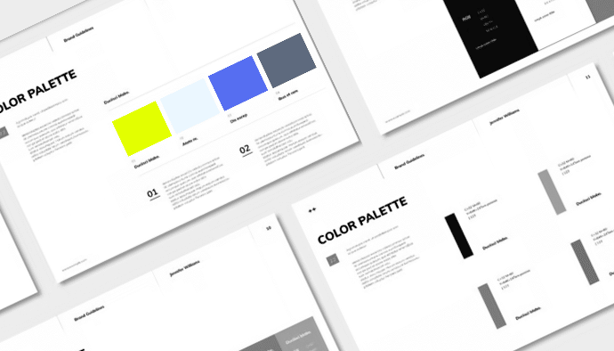
Consistency is king—or should we say the “queen” of color branding. When your brand colors remain consistent, they become synonymous with your brand identity, increasing recall. Inconsistency, on the other hand, dilutes your brand’s strength.
Color Palette Inspiration
Not sure where to start? Here are a few sources of inspiration:
- Nature: Mother Nature knows her colors! Sunsets, forests, and oceans provide stunning palettes.
- Art: From Renaissance masterpieces to modern art, there’s no shortage of color creativity in the world of art.
- Cultural Symbols: Different cultures have deep-rooted symbolism tied to color.
Tools for Creating Color Palettes
Need a hand? Tools like Adobe Color, Coolors, and Paletton can help you create stunning, cohesive color palettes for your brand.
Using Color to Evoke Emotion
The Power of Emotional Branding
Research shows emotions drive purchasing decisions more than logic. Color is a shortcut to the emotions you want to evoke.
How to Use Color to Evoke Specific Emotions
- Excitement: Red and orange will fire up excitement and urgency, perfect for call-to-action buttons.
- Calmness: Blue and green soothe nerves and build trust, ideal for healthcare brands.
- Luxury and Sophistication: Purple, black, and gold often evoke luxury and exclusivity.
Case Study: Coca-Cola
Look no further than Coca-Cola, whose red branding immediately sparks energy, passion, and excitement—a huge part of why it’s been a household name for over a century.
Color and Brand Personality
Defining Brand Personality
Brand personality refers to the human traits attributed to your brand. Is your brand playful, serious, professional, or quirky? Color choice should reflect this.
Color and Personality Traits
If your brand is energetic and fun, bright colors like yellow or orange might be your go-to. For a more serious tone, blue or black might fit better.
Case Study: Harley-Davidson

Harley-Davidson’s brand is the epitome of rugged individualism, rebellion, and strength—all of which are embodied by its distinctive black and orange color palette. This combination is anything but accidental. Black, as a primary color in Harley’s branding, evokes power, sophistication, and a no-nonsense attitude. It’s sleek and intimidating, communicating authority and a sense of belonging to an exclusive club of riders who value freedom and individuality above all.
The use of orange, on the other hand, injects energy, excitement, and warmth into the brand’s identity. Orange adds a layer of enthusiasm and visibility, standing out on the iconic Harley-Davidson logo and adding vibrancy to their motorcycles’ accents. Together, these colors strike a balance—orange softens the intensity of black while still maintaining Harley’s bold, daring edge.
Harley-Davidson’s branding extends through it’s color palette; it is reinforced through every touchpoint, from the roaring engines of their motorcycles to the leather jackets worn by their loyal riders. The combination of black and orange is seen on apparel, merchandise, marketing materials, and of course, on their bikes. It has become synonymous with the “Harley lifestyle”—one that embodies toughness, freedom on the open road, and a countercultural spirit.
This strategic color usage amplifies Harley-Davidson’s strong brand identity and makes it instantly recognizable. The brand’s rebellious color choices are not just aesthetic—they’re deeply intertwined with its core message and community values, creating an emotional bond with its audience. It’s a masterclass in how a cohesive, thoughtfully executed color palette can reflect and amplify a brand’s personality and mission.
Color and Cultural Nuances
The Importance of Cultural Sensitivity
Color meanings change across cultures. Red, for instance, may represent luck in China but mourning in South Africa. Know your audience to avoid brand faux pas.
Tips for Creating Culturally Sensitive Color Palettes
- Research: Study color meanings in your target market(s) before making a final decision.
- Consult with Experts: Collaborate with designers and marketing experts to ensure your colors resonate with the intended audiences.
- Get Feedback: Talk to people in your industry as well as current and potential clients. Hear what they have to say and let it help guide your decisions.
Cultural nuances are subtle, but they can make or break brand perception in different regions.
Color in Digital Branding
Color and Website Design
Color choice can make or break user experience (UX) on your website. Ensure text is legible, colors evoke the desired emotions, and don’t overwhelm visitors. Keep in mind accessibility—contrast is crucial!
Color and Social Media
Bright, bold colors can make your social media posts pop, while muted tones can offer sophistication. Remember, your social profiles are a mini-reflection of your brand, so keep it consistent.
Color and Email Marketing
Did you know color can increase email open and click-through rates? An enticing button color might be all you need to increase conversions.
Color in Print and Packaging Design
Color and Print Design
From brochures to business cards, color can grab attention or encourage engagement. A coherent color palette ensures that physical materials reinforce digital branding.
Color and Packaging Design
Standing out on the shelf is vital. Bright, contrasting colors catch eyes, while subtle hues can communicate luxury and exclusivity. Think about the unboxing experience, too—every element matters.
Case Study: Tiffany & Co.

When it comes to using color to make a brand unforgettable, Tiffany & Co. pretty much wrote the rulebook—and did it in a shade of blue so iconic it’s named after them. Tiffany Blue isn’t just a pretty color; it’s a global symbol of luxury, exclusivity, and jaw-dropping elegance. Think about it: you spot that robin’s egg blue box with the crisp white ribbon, and you instantly know what’s inside is special—no guessing needed.
The story of how this color became Tiffany’s crown jewel dates back to 1845, when it first appeared on the cover of the brand’s Blue Book catalog. Fast forward to today, and that same shade is protected by trademark, meaning no other jeweler can get away with copying it. That’s how you turn a color into a luxury brand’s secret weapon. Seeing that blue sparks a rush of emotions—romance, celebrations, and “oh wow” moments—without saying a single word.
Tiffany doesn’t just slap this color on boxes and call it a day. It’s everywhere—stores, marketing campaigns, their website, even their social media posts. This relentless consistency turns every interaction into a cohesive, immersive brand experience. It’s why you can spot their packaging from a mile away and instantly think of elegance and luxury.
The lesson here? Small businesses and brands starting out should take notes. Color consistency transforms something as simple as a blue box into a cultural icon. Commit to your chosen colors, use them thoughtfully, and pretty soon, customers will see your colors and think only of you—just like the world does with Tiffany’s signature blue. Now that’s brand power.
In Conclusion: Color Connects, Communicates & Convinces
Color is one of the most powerful tools in your branding arsenal, capable of evoking emotions, strengthening brand personality, navigating cultural landscapes, and much more.
Don’t underestimate the power of color! Test, refine, and use color to elevate your brand’s impact and connect with your target audience. If you need help, give me a shout or reach out to your marketing professional, that’s why we’re here.
In closing, remember, color isn’t just a pretty face—it’s a core part of your brand strategy. Use it wisely, and it will speak volumes.

