Let’s be brutally honest here. If you’re a small business owner, a marketing pro, or a seasoned designer, you’ve probably heard the words “style guide” tossed around at trade shows, during coffee breaks, or in those never-ending Zoom calls. People talk about it like it’s the Holy Grail of their brand. And you know what? They’re right.
A style guide is your brand’s lifeline. It sets the tone for how your visual identity, brand messaging, and overall vibe resonate across every single channel. Picture the friend who’s always impeccably dressed. No matter the event, that friend looks flawless and appropriate. That’s your business—IF you create AND adhere to a style guide!
I’ll share exactly why a style guide is non-negotiable in modern branding. We’ll dismantle any hesitations about “too much structure” and highlight the irreverent joys of having a set of rules that keep chaos at bay. Later, we’ll look at some noteworthy style guides, including NASA’s bold graphics standards manual and New York City Transit Authority’s meticulously curated brand instructions. By the end, you’ll be itching to create or refine your very own style guide.
But first, let’s cut through the nonsense. Why do we call these documents “style guides”? The short answer: They guide your style. Duh, right? But what does that specifically and practically mean? Well, we’re going to cover that and so much more today, because when your brand identity, design, voice, and visuals are consistent, you can begin to conquer the world—or at least your niche. Let’s dive in!
The Bold Truth About Style Guides
So, let’s begin with a bold truth: a style guide is the difference between a brand that’s recognized and connects to their audience and a brand that’s: “Who? Never heard of them.”
Style guides (and similar documents—brand guidelines, brand books, graphic standards manuals) exist for one reason: to inject your brand with a sense of uniformity that screams “We know who we are.” Without a style guide, you’re at the mercy of fluctuating trends, the mood or whims of your design or marketing staff, inconsistent logos and fonts, and color palettes that look like they were chosen by an over-caffeinated leprechaun .
But it doesn’t have to be that way. And all style guides are not created equal—they should be fitted to the needs of your business and your brand. Some are mere pamphlets that mention the primary color in passing. Others are lavish works of art with gold-leaf covers and more brand philosophies than you thought possible. Somewhere in between lives the perfect style guide for you.
For designers, style guides are our daily bread. They keep us from having to “explain yet again” why we don’t want a second (third or fourth) typeface in that website header. For marketing professionals, they reduce friction and free up time for focusing on strategy instead of bickering about brand colors or rearranging the logo to fit on a t-shirt. For small business owners, they serve as a compass. They guide you away from design disasters and push you toward a brand presence that radiates confidence.
And if you’re managing marketing and design projects, style guides save you tons of time! Here’s why: style guides provide the initial guidance on your brand’s aesthetic and voice, answering many of the questions you would normally need to answer when kicking off a new project or working with a new freelancer or vendor. Now you just give them the style guide—done.
Style guides aren’t just for giant corporations with offices in glass skyscrapers. They’re for anyone who cares about connecting with their target audience.
Here’s the kicker: People trust a brand that looks, sounds, and behaves the same way across all touchpoints. Consistency if comforting, and everybody likes feeling comfortable. Even if your brand is edgy or provocative, your target audience wants you to be consistent in your specific style of edginess. A style guide is the key to achieving that. If you don’t have one, you might as well be wearing mismatched socks on a first date—some might find it endearing, but most will swipe left. Seriously, rolling without a style guide is the marketing equivalent of sitting at the kiddie table.
Essential Elements of a Style Guide
Now, let’s get specific. I’ll break down the essential elements of a typical style guide. This is your blueprint for brand domination, so sit tight.
1. Brand Story or Mission Statement
What it is: A concise explanation of your brand’s purpose, core values, and unique positioning. In short, it’s why you exist.
Why it’s important: It grounds every decision you make. If your junior designer or your executive team doesn’t understand the “why,” they’ll never get the “how.” Without a well-placed brand story up front, it’s like dropping readers into the final action scene of a movie with no context, setup or emotional investment. Don’t rob people of the chance to care.
📌 Pro Tip: Use plain language that resonates with your audience. Show some passion—you’re not writing a grocery list; you’re revealing why you exist.
2. Logo Usage
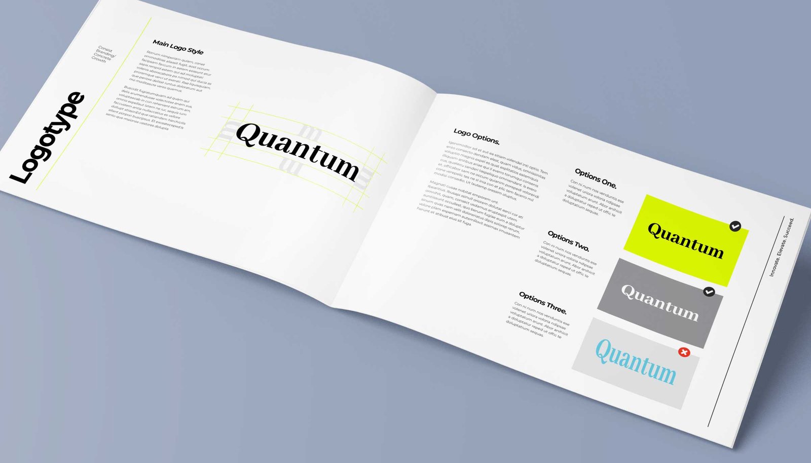
What it is: Rules on how to handle your logo, covering color variations, minimum size requirements, the “safe area,” and “thou shalt not” treatments.
Why it’s important:
Your logo is often the first impression people have of your brand, so you want it looking sharp and consistent everywhere it shows up. A warped logo is like an enormous neon sign that says, “We don’t know what we’re doing.” Or even worse: “Scam!”
Lock that logo down. No one wants to see the brand mark warped, text squished or that color reversed “just for fun.”
📌 Pro Tip: Include practical visuals. Show examples of correct usage and the cringe-worthy “never do this” scenarios, so people get it right the first time.
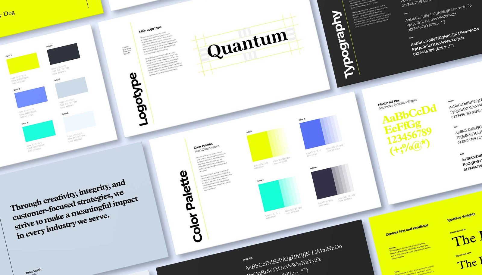
3. Color Palette

What it is: A curated set of primary and secondary colors, complete with their exact print, digital, and specialty codes. This includes Pantone, CMYK, RGB, HEX, and anything else your brand might need. Got a product line in plastics? Make sure you list those color references too.
Why it’s important: Color sets the emotional tone and fosters recognition in our brains. It’s a shortcut in our already overloaded brains. If you start swapping brand colors on a whim, you risk confusing your audience and looking amateurish—like you’re having a midlife crisis every other week.
Imagine Coca-Cola ditching it’s signature red because some half-wit thought it was “Boring,” and time for a change. Enough said.
📌 Pro Tip: Create color hierarchy. Show the main hero color and how it pairs with accent hues. Nobody should ever guess your brand’s shade of blue.
4. Typography
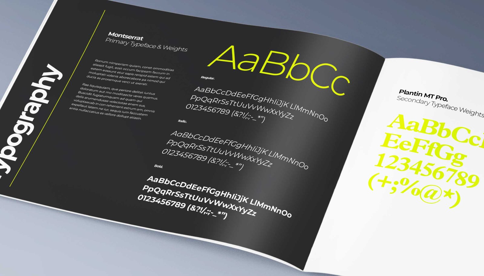
What it is: A clear rundown of your brand’s fonts—headlines, body text, web-safe fonts, decorative flourishes, etc. This includes specifics on spacing, sizing, and usage across different channels.
Why it’s important: Typography affects mood, readability, and overall brand character. Font consistency is important. You don’t what your Facebook ad looking like a ransom note, that’s never a good way to say “We’re a trustworthy brand.”
📌 Pro Tip: Specify fallback fonts for the web or older systems (looking at you email apps). Otherwise, your carefully chosen type might morph into something unpleasant on certain devices.
5. Imagery & Photography Style
What it is: Guidance on the style of images—candid, minimalist, lifestyle-focused, aspirational or hyper-abstract. It also covers any recurring effects, overlays, or filters your brand uses (consistently, of course).
Why it’s important: Visuals tell a deeper story. You know the classic adage, “A picture is worth a thousand words.” Following your style guide ensures their the right thousand words. Use consistent image styles to reinforce your brand’s narrative. Ditch the random social media filters, you’re not here to create random memes (unless that’s your brand’s thing); you’re here to connect and engage.
📌 Pro Tip: Include a short do-and-don’t list with actual photo examples. Show how a consistent photography style unifies your brand’s visual output.
6. Tone of Voice & Messaging
What it is: Defines your brand personality in written or verbal form, whether it’s formal, casual, witty, or irreverent. Your brand’s persona shining through text, speech, and even the subtlety of punctuation. When done right, it’s like having same person, in the same mood communicating all your brand’s messaging.
Why it’s important: A consistent voice builds trust. If you crack jokes on Twitter but sound like a 19th-century banker in emails, people will wonder which personality is the real you. And a brand with a personality crisis isn’t really a trust builder.
📌 Pro Tip: Provide examples of voice in different contexts—social posts, newsletters, product descriptions. Make it crystal clear how your brand “talks” to the world.
7. Editorial Guidelines
What it is: The framework for all written content. It addresses grammar rules, spelling preferences (color vs. colour), brand-specific jargon, and how to present data or quotes. It’s how you present your brand in the context of language and grammar.
Why it’s important: Keeps all content pristine, aligned, and easy to read. Imagine you’re at a conference, and the speaker keeps referring to themselves in the third person. It’s weird. Inconsistent editorial guidelines can feel just as odd to your audience.
📌 Pro Tip: Mention if you follow AP Style, Chicago Manual of Style, or your own custom blend. Make sure brand-specific terms are spelled and capitalized consistently every time.
People are drawn to what’s familiar. A style guide ensures that every tweet, billboard, and packaging design sings the same tune.
8. Layout & Grid Systems
What it is: Structural guidelines for your designs—margins, columns, grid systems, and spacing rules. These apply to print collateral, websites, mobile apps, and even those “urgent” PowerPoint slides.
Why it’s important: Design anarchy leads to brand confusion. Consistent layouts help people process information faster. They also help you churn out designs in record time because you’re not reinventing the layout each go-around.
📌 Pro Tip: Show how grids adapt across responsive layouts. Include examples for mobile, tablet, and desktop if you’re dealing with digital products.

9. Examples & Applications
What it is: Real-world mockups showcasing your style guide in action.
Why it’s important: Demonstrates correct usage for newbies and external partners. Great for visual learners, like me. Even the best written style guides can be misinterpreted. Visual references give your team and partners a clear idea of what “right” looks like, so they’re less likely to make disastrous design mistakes.
📌 Pro Tip: Feature “before and after” examples if you’ve evolved your brand. It gives context for why the changes matter.
10. Additional Elements
What it is: For everything else that doesn’t fit neatly into the above categories. This might be motion design principles, video intro styles, podcast branding, or social media templates.
Why it’s important: If your brand consistently appears in a certain medium, don’t leave its styling to chance. Perhaps your brand thrives on YouTube or creates informational animated videos. Outline that protocol here.
📌 Pro Tip: Update this section whenever your brand expands into new mediums. Keep it flexible, so you can pivot quickly without confusion.
Remember: Your style guide is more than a checklist. It’s the blueprint for brand domination. So, write it like you mean it, enforce it like your reputation depends on it (because it does), and watch as every aspect of your brand aligns in glorious harmony.
Why Style Guides Are Non-Negotiable
Style guides aren’t just for giant corporations with offices in glass skyscrapers. They’re for anyone who cares about connecting with their target audience. If you don’t care about that, well, you probably haven’t read this far anyway. For those that do care, style guides are essential because:
- Consistency Builds Trust: People are drawn to what’s familiar. A style guide ensures that every tweet, billboard, and packaging design sings the same tune.
- Efficiency & Scalability: When you onboard a new designer, you don’t want them guessing about the hex codes or recommended typeface. Hand over your style guide, and watch them integrate faster than you can say “brand equity.”
- Professionalism & Credibility: Sloppy branding is a one-way ticket to irrelevance. If your brand visuals are all over the place, potential customers may assume your products or services are, too.
- Clarity for Collaboration: Ever spent hours arguing about the right shade of blue in a conference room? A style guide squashes that nonsense immediately. Everyone refers to the same “blue,” and life moves on.
- Preserving Brand Equity: Your brand is an asset. Each consistent interaction amplifies your brand equity, locking in customer loyalty. That’s money in the bank.
Who Crafts and Who Uses a Style Guide
I’ve created and used countless style guides throughout my career. I love creating them— crafting a carefully curated buffet of practical creative guidelines is highly satisfying to me. But I also enjoy being on the other end of a style guide, having that creative direction provides me the framework I need to be successful in whatever the project might be—website, email marketing campaign, etc..
Creators: Brand strategists, creative directors, marketing teams, design agencies, or brand consultants. They gather stakeholder input and merge it into an epic brand narrative.
Users: Internal teams like marketing, design, communications, product, HR, and sales. Plus, external partners such as agencies, freelancers, vendors, and printers.
Anyone who touches your brand needs the style guide. That includes the sales exec that’s building the pitch deck for next week’s big meeting with ACME inc., and the well-meaning intern who’s about to craft your next 3 a.m. tweet.

Business Benefits: Your Style Guide, a Powerful Weapon
I’ve seen small businesses rise from obscurity using a rock-solid style guide. I’ve also seen big brands crumble because they ignored it. The difference is stark.
- Strengthens Brand Recognition: Customers see your color palette, logo, and tone of voice over and over. That repetition cements you in their minds.
- Protects Your Investment: You spend time and money building your brand. Don’t let sloppy execution sabotage your investment.
- Saves Time and Money: With clear standards, your team can create marketing materials without endless revisions or “back to the drawing board” nightmares.
- Establishes Professionalism: When your brand is consistent, people assume you’ve got your act together. That can make the difference between a sale and a “no, thanks.”
Risks and Pitfalls of Not Using a Style Guide
If you think skipping a style guide saves time, you’re probably missing the bigger picture.
1. Inconsistent Brand Identity
Customers won’t recognize you if you change logos or fonts every time you get bored. Can you imagine how bored the designers, marketers and sales team at Nike can get of the Swoosh or their brand orange? But what would happen to the brand’s strength and recognition if Nike changed their logo or brand color every time some executive or designer got bored? Your brand wasn’t created for your or your team, it was created for your target audience—your consumers, customers or clients—and they want consistency! The trick here is to work inside the brand’s framework to create new energy and excitement! Coca-Cola has maintained the same logo and color (with a few small tweaks) for over 120 years, while also remaining fresh and relevant. If you have a good brand, stick with it!
2. Wasted Resources
Freelancers might deliver random design interpretations. You’ll waste money on reprints, do-overs, and squashing fires.
3. Eroded Trust
Inconsistent or subpar branding can make potential customers question your reliability.
4. Difficulty Onboarding New Staff or Agencies
Without a reference, your brand is a total mystery. Training becomes an uphill battle.
Creative Guides and Standards For Every Niche
You have your style guide, but guess what? Other documents exist to cover every industry and niche out there. Some of these guides and standards can work in tandem with your style guide covering different areas of your brand. For example, marketing and editorial have very unique needs as there intent is different, therefore you might want to have a Brand Book (or traditional style guide) for marketing and an Editorial or Content Guide for the editorial team. This way you support the parts of your brands with creative direction tailored to the respective intent and audience. Here are some documents similar to the style guide that help keep brands bulletproof:
1. Brand Guidelines / Brand Book
Coverage: Visual identity, messaging, brand mission, values.
Purpose: Your holistic, go-to reference.
2. Visual Identity Guidelines
Coverage: Logo usage, color palettes, typography, and layout rules.
Purpose: Ensures visual elements unite in harmony.
3. Editorial Style Guide
Coverage: Grammar, tone of voice, brand-specific language.
Purpose: Consistent brand “voice” across every comma and semicolon.
4. Content Guidelines
Coverage: Social media, blogs, video scripts, any content marketing assets.
Purpose: Keeps your narrative cohesive across platforms.
5. Design System / UI Pattern Library
Coverage: Reusable UI components, interaction patterns, accessibility standards.
Purpose: Ensures consistent UX/UI in web and app interfaces.
6. Brand Architecture Guidelines
Coverage: How sub-brands, products, or services fit together.
Purpose: Maintains coherence when your empire expands.
7. Brand Bible / Brand Manual
Coverage: All-encompassing resource that includes brand philosophy, legal usage, design, tone of voice.
Purpose: The definitive reference for brand religion.
8. Tone and Voice Guidelines / Communication Playbook
Coverage: Detailed directions on language use and scenario handling.
Purpose: Keeps messaging consistent in every channel.
9. Motion or Animation Guidelines
Coverage: Rules for branded animations.
Purpose: Sets the standard for how animations flow and feel.
10. Photography / Imagery Style Guide
Coverage: Image style, composition, editing, sourcing.
Purpose: Gives your brand a uniform visual vibe.
Notable Style Guides (and Similar Creative Documents)
We all crave a bit of design history, right? Below are some heavy hitters that have forever altered how we see style guides.
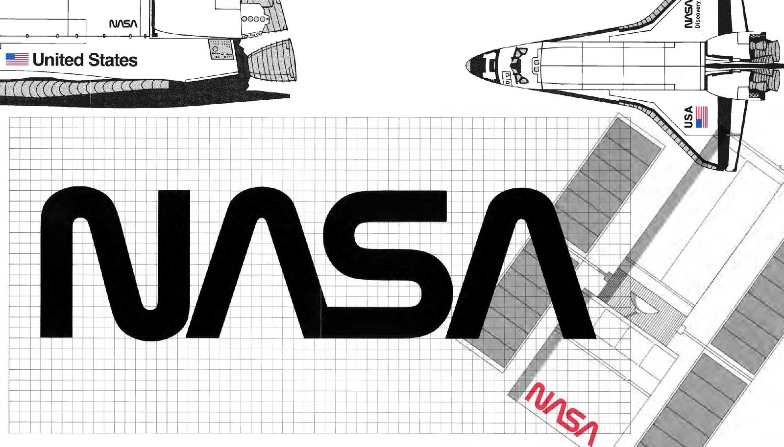
1. NASA Graphics Standards Manual
Type of Document: Graphic Standards Manual
Why It’s Important: NASA needed a futuristic, cohesive look. Danne & Blackburn created the “worm” logo in 1975. It screamed innovation and became iconic. Even decades later, the worm was revived for modern missions. You can’t beat that brand equity.
2. London Underground Style Guide
Type of Document: Visual Identity Guidelines
Why It’s Important: The London Underground’s signage and typeface unify one of the world’s most complex transit systems. It’s a masterclass in making chaos navigable and brand identity unforgettable.
3. BBC’s Global Experience Language (GEL)
Type of Document: Design System / UI Pattern Library
Why It’s Important: The BBC touches millions of people worldwide. The BBC’s GEL ensures design coherence across all digital platforms. That consistency fosters trust, especially in news—where credibility is critical.
4. Apple Human Interface Guidelines (HIG)
Type of Document: Design System / UI Pattern Library
Why It’s Important: Apple’s hallmark is user-centric simplicity. Apple’s Human Interface Guidelines dictates app design for iOS, macOS, watchOS, and more. The result is a cohesive ecosystem that customers recognize instantly.
5. Starbucks’ Brand Guidelines
Type of Document: Brand Guidelines / Brand Book
Why It’s Important: Starbucks applies a consistent look and feel, from store layouts to the famous Siren. This continuity cements the brand’s status as the cozy coffeehouse next door—even if you’re actually in Tokyo or Toronto.
6. New York City Transit Authority Graphic Standards Manual
Type of Document: Graphic Standards Manual
Why It’s Important: Massimo Vignelli and Bob Noorda revolutionized subway signage in NYC. Their design system turned chaos into clarity. Millions of commuters benefit from that brilliance daily.
7. Google’s Material Design
Type of Document: Design System / UI Pattern Library
Why It’s Important: Google’s suite of products demanded a unified experience. Google’s Material Design sets guidelines for color, motion, and layout, ensuring consistent user experiences across a massive product portfolio.
In Conclusion: Style Meets Structure
I’ve watched brilliant brands skyrocket thanks to a well-documented style guide. I’ve also seen sloppy brands fade into oblivion. The difference is often a well-defined set of rules that every stakeholder respects. By creating a strong style guide—and actually using it—you set a standard that resonates with customers, employees, and partners alike.
Let’s wrap this up with a tidy list summarizing the top 5 reasons you need to prioritize a style guide now:
- Consistency: Your brand identity stays rock-solid across all channels, building trust and familiarity with your audience.
- Credibility: Professionally maintained brands are seen as credible. Customers sense professionalism and trust you with their money.
- Efficiency: Faster onboarding, quicker approvals, and fewer design “emergencies.” Clear standards for you and your team, and clarity is always efficient.
- Longevity: Your style guide is a blueprint for the future. It adapts and evolves with your brand. The key word being evolve—small gradual changes over time that help your brand adapt to cultural shifts and new technology or media, while maintaining the brand’s core self.
- Success: Standing out in a crowded market is critical to your brand’s success. Once you’ve established your unique brand, you want to hold on to it. And that’s the purpose of a style guide—it helps you protect and position your brand for future success.
Remember, a style guide isn’t just for big shots. If you’re serious about building a recognizable, memorable brand, you owe it to yourself (and your audience) to get one started. When you’re in doubt (or bored), think about all those legendary examples—NASA, Apple, Starbucks, NYC Transit. They didn’t get to be cultural icons by winging it.
So, my final call to action is straightforward: Don’t let your brand wander around in a mismatched suit, spouting contradictory catchphrases. Build a style guide. Enforce it. Your style guide is more than a checklist. It’s the blueprint for brand domination. So, write it like you mean it, enforce it like your reputation depends on it (because it does). Start small, it doesn’t need to be complicated. For most small to medium businesses, one page is enough to align and protect the basics: mission, logo, colors, and fonts. Just that simple one page document is invaluable to your brand.
Go forth, be bold, be you, and let your style guide lead the way. All hail the style guide!